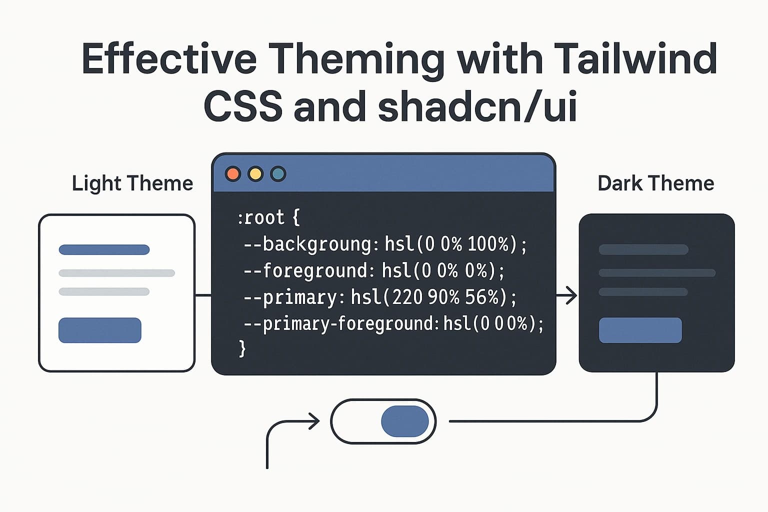
Effective Theming with Tailwind CSS and shadcn/ui
In modern web development, creating a consistent design system is crucial. This guide shows you how to build a flexible theming solution using Tailwind CSS and shadcn/ui components.
Why This Combination Works
Tailwind CSS provides utility-first styling that's highly customizable, while shadcn/ui offers accessible, unstyled components built on Radix UI primitives. Together, they create a powerful foundation for themed applications that can:
- Scale with your project needs
- Maintain consistency across components
- Switch between themes seamlessly
- Support both light and dark modes
Project Setup
Start with a fresh Next.js project:
npx create-next-app@latest my-themed-app --typescript --tailwind
cd my-themed-app
Add shadcn/ui with its CLI tool:
npx shadcn-ui@latest initWhen prompted, be sure to select "Yes" for CSS variables to enable theming capabilities.
Creating Your Theme System
1. Define Theme Variables
The foundation of your theming system lies in your CSS variables. Add these to your globals.css:
@tailwind base;
@tailwind components;
@tailwind utilities;

@layer base {
  :root {
    /* Base colors */
    --background: 0 0% 100%;
    --foreground: 222.2 84% 4.9%;

    /* Primary colors */
    --primary: 221.2 83.2% 53.3%;
    --primary-foreground: 210 40% 98%;

    /* Secondary colors */
    --secondary: 210 40% 96.1%;
    --secondary-foreground: 222.2 47.4% 11.2%;

    /* Accent and UI states */
    --accent: 210 40% 96.1%;
    --accent-foreground: 222.2 47.4% 11.2%;
    --muted: 210 40% 96.1%;
    --muted-foreground: 215.4 16.3% 46.9%;

    /* Functional colors */
    --destructive: 0 84.2% 60.2%;
    --destructive-foreground: 210 40% 98%;

    /* Component-specific */
    --card: 0 0% 100%;
    --card-foreground: 222.2 84% 4.9%;
    --popover: 0 0% 100%;
    --popover-foreground: 222.2 84% 4.9%;

    /* Border and radius */
    --border: 214.3 31.8% 91.4%;
    --input: 214.3 31.8% 91.4%;
    --radius: 0.5rem;
  }

  .dark {
    /* Base colors */
    --background: 222.2 84% 4.9%;
    --foreground: 210 40% 98%;

    /* Primary colors */
    --primary: 217.2 91.2% 59.8%;
    --primary-foreground: 222.2 47.4% 11.2%;

    /* Secondary colors */
    --secondary: 217.2 32.6% 17.5%;
    --secondary-foreground: 210 40% 98%;

    /* Accent and UI states */
    --accent: 217.2 32.6% 17.5%;
    --accent-foreground: 210 40% 98%;
    --muted: 217.2 32.6% 17.5%;
    --muted-foreground: 215 20.2% 65.1%;

    /* Functional colors */
    --destructive: 0 62.8% 60.6%;
    --destructive-foreground: 210 40% 98%;

    /* Component-specific */
    --card: 222.2 84% 4.9%;
    --card-foreground: 210 40% 98%;
    --popover: 222.2 84% 4.9%;
    --popover-foreground: 210 40% 98%;

    /* Border */
    --border: 217.2 32.6% 17.5%;
    --input: 217.2 32.6% 17.5%;
  }
}
2. Update Your Tailwind Config
Configure Tailwind to use your CSS variables:
/** @type {import('tailwindcss').Config} */
module.exports = {
  darkMode: ["class"],
  content: [
    './pages/**/*.{ts,tsx}',
    './components/**/*.{ts,tsx}',
    './app/**/*.{ts,tsx}',
  ],
  theme: {
    extend: {
      colors: {
        border: "hsl(var(--border))",
        input: "hsl(var(--input))",
        background: "hsl(var(--background))",
        foreground: "hsl(var(--foreground))",
        primary: {
          DEFAULT: "hsl(var(--primary))",
          foreground: "hsl(var(--primary-foreground))",
        },
        secondary: {
          DEFAULT: "hsl(var(--secondary))",
          foreground: "hsl(var(--secondary-foreground))",
        },
        destructive: {
          DEFAULT: "hsl(var(--destructive))",
          foreground: "hsl(var(--destructive-foreground))",
        },
        muted: {
          DEFAULT: "hsl(var(--muted))",
          foreground: "hsl(var(--muted-foreground))",
        },
        accent: {
          DEFAULT: "hsl(var(--accent))",
          foreground: "hsl(var(--accent-foreground))",
        },
        card: {
          DEFAULT: "hsl(var(--card))",
          foreground: "hsl(var(--card-foreground))",
        },
        popover: {
          DEFAULT: "hsl(var(--popover))",
          foreground: "hsl(var(--popover-foreground))",
        },
      },
      borderRadius: {
        lg: "var(--radius)",
        md: "calc(var(--radius) - 2px)",
        sm: "calc(var(--radius) - 4px)",
      },
    },
  },
  plugins: [require("tailwindcss-animate")],
}
Building a Component System
Create your own component abstractions on top of shadcn/ui:
// components/ui/Button.tsx
import { cn } from "@/lib/utils";
import { Button as ShadcnButton } from "@/components/ui/button";
import { forwardRef } from "react";

export interface ButtonProps extends React.ComponentProps<typeof ShadcnButton> {
  rounded?: boolean;
}

export const Button = forwardRef<HTMLButtonElement, ButtonProps>(
  ({ className, rounded, ...props }, ref) => {
    return (
      <ShadcnButton
        className={cn(
          rounded && "rounded-full",
          className
        )}
        ref={ref}
        {...props}
      />
    );
  }
);

Button.displayName = "Button";
Theme Switching Implementation
Create a theme provider to manage dark/light modes:
// components/ThemeProvider.tsx
"use client";

import { createContext, useContext, useEffect, useState } from "react";

type Theme = "light" | "dark" | "system";

type ThemeProviderProps = {
  children: React.ReactNode;
  defaultTheme?: Theme;
};

type ThemeProviderState = {
  theme: Theme;
  setTheme: (theme: Theme) => void;
};

const ThemeContext = createContext<ThemeProviderState | undefined>(undefined);

export function ThemeProvider({
  children,
  defaultTheme = "system",
}: ThemeProviderProps) {
  const [theme, setTheme] = useState<Theme>(defaultTheme);

  useEffect(() => {
    const root = window.document.documentElement;

    root.classList.remove("light", "dark");

    if (theme === "system") {
      const systemTheme = window.matchMedia("(prefers-color-scheme: dark)")
        .matches
        ? "dark"
        : "light";

      root.classList.add(systemTheme);
      return;
    }

    root.classList.add(theme);
  }, [theme]);

  return (
    <ThemeContext.Provider value={{ theme, setTheme }}>
      {children}
    </ThemeContext.Provider>
  );
}

export const useTheme = () => {
  const context = useContext(ThemeContext);

  if (context === undefined) {
    throw new Error("useTheme must be used within a ThemeProvider");
  }

  return context;
};
Add it to your app:
// app/layout.tsx
import { ThemeProvider } from "@/components/ThemeProvider";
import "./globals.css";

export default function RootLayout({
  children,
}: {
  children: React.ReactNode;
}) {
  return (
    <html lang="en" suppressHydrationWarning>
      <body>
        <ThemeProvider>
          {children}
        </ThemeProvider>
      </body>
    </html>
  );
}
Create a theme toggle:
// components/ThemeToggle.tsx
"use client";

import { useTheme } from "@/components/ThemeProvider";
import { Button } from "@/components/ui/Button";
import { Moon, Sun } from "lucide-react";

export function ThemeToggle() {
  const { theme, setTheme } = useTheme();

  return (
    <Button
      variant="ghost"
      size="sm"
      onClick={() => setTheme(theme === "light" ? "dark" : "light")}
    >
      {theme === "light" ? (
        <Moon className="h-5 w-5" />
      ) : (
        <Sun className="h-5 w-5" />
      )}
      <span className="sr-only">Toggle theme</span>
    </Button>
  );
}
Advanced Theme Strategies
1. Multi-Brand Theming
Support multiple color schemes with brand-specific classes:
/* globals.css - Multi-brand themes */
.theme-blue {
  --primary: 221.2 83.2% 53.3%;
  --primary-foreground: 210 40% 98%;
}

.theme-green {
  --primary: 142.1 76.2% 36.3%;
  --primary-foreground: 355.7 100% 97.3%;
}

.theme-purple {
  --primary: 262.1 83.3% 57.8%;
  --primary-foreground: 210 40% 98%;
}
Create a brand theme switcher:
// components/BrandThemeSwitcher.tsx
"use client";

import { useState, useEffect } from "react";
import { Button } from "@/components/ui/Button";

type BrandTheme = "default" | "blue" | "green" | "purple";

export function BrandThemeSwitcher() {
  const [brand, setBrand] = useState<BrandTheme>("default");

  useEffect(() => {
    const root = window.document.documentElement;
    root.classList.remove("theme-blue", "theme-green", "theme-purple");

    if (brand !== "default") {
      root.classList.add(`theme-${brand}`);
    }
  }, [brand]);

  return (
    <div className="flex space-x-2">
      <Button
        variant={brand === "default" ? "default" : "outline"}
        onClick={() => setBrand("default")}
      >
        Default
      </Button>
      <Button
        variant={brand === "blue" ? "default" : "outline"}
        onClick={() => setBrand("blue")}
      >
        Blue
      </Button>
      <Button
        variant={brand === "green" ? "default" : "outline"}
        onClick={() => setBrand("green")}
      >
        Green
      </Button>
      <Button
        variant={brand === "purple" ? "default" : "outline"}
        onClick={() => setBrand("purple")}
      >
        Purple
      </Button>
    </div>
  );
}
2. Component Example
Here's a card component that leverages your theme system:
// app/page.tsx
import { ThemeToggle } from "@/components/ThemeToggle";
import { BrandThemeSwitcher } from "@/components/BrandThemeSwitcher";
import { Button } from "@/components/ui/Button";

export default function Home() {
  return (
    <main className="min-h-screen bg-background p-8">
      <div className="max-w-4xl mx-auto">
        <div className="flex justify-between items-center mb-6">
          <h1 className="text-3xl font-bold text-foreground">Themed Components</h1>
          <div className="flex items-center gap-4">
            <BrandThemeSwitcher />
            <ThemeToggle />
          </div>
        </div>

        <div className="grid grid-cols-1 md:grid-cols-2 gap-6 mt-8">
          <div className="p-6 bg-card text-card-foreground rounded-lg border border-border shadow">
            <h2 className="text-2xl font-bold mb-4">Button Examples</h2>
            <div className="flex flex-wrap gap-2">
              <Button>Default</Button>
              <Button variant="secondary">Secondary</Button>
              <Button variant="outline">Outline</Button>
              <Button variant="destructive">Destructive</Button>
              <Button rounded>Rounded</Button>
            </div>
          </div>

          <div className="p-6 bg-card text-card-foreground rounded-lg border border-border shadow">
            <h2 className="text-2xl font-bold mb-4">Theme Preview</h2>
            <div className="space-y-4">
              <div className="flex items-center gap-2">
                <div className="w-10 h-10 rounded bg-background"></div>
                <span>Background</span>
              </div>
              <div className="flex items-center gap-2">
                <div className="w-10 h-10 rounded bg-primary"></div>
                <span>Primary</span>
              </div>
              <div className="flex items-center gap-2">
                <div className="w-10 h-10 rounded bg-secondary"></div>
                <span>Secondary</span>
              </div>
              <div className="flex items-center gap-2">
                <div className="w-10 h-10 rounded bg-accent"></div>
                <span>Accent</span>
              </div>
            </div>
          </div>
        </div>
      </div>
    </main>
  );
}
Best Practices
- Component Consistency: Create wrapper components for shadcn/ui components to maintain consistency in styling and behavior.
- Theme Organization: Separate theme concerns from component implementation.
- Semantic Color Names: Use semantic color names in your CSS variables rather than specific color values.
- Documentation: Maintain a style guide for your design system.
- Dynamic Loading: Consider loading themes dynamically based on user preferences or settings.
Real-World Example: Dashboard
Here's a simplified dashboard example using your theming system:
// app/dashboard/page.tsx
"use client";

import { useState } from "react";
import { ThemeToggle } from "@/components/ThemeToggle";
import { Button } from "@/components/ui/Button";

export default function Dashboard() {
  const [activeTab, setActiveTab] = useState("overview");

  return (
    <div className="min-h-screen bg-background">
      <header className="border-b border-border">
        <div className="max-w-7xl mx-auto px-4 sm:px-6 lg:px-8">
          <div className="flex justify-between items-center h-16">
            <h1 className="text-xl font-bold text-primary">Dashboard</h1>
            <ThemeToggle />
          </div>
        </div>
      </header>

      <main className="max-w-7xl mx-auto px-4 sm:px-6 lg:px-8 py-6">
        <div className="mb-6 flex space-x-2">
          <Button
            variant={activeTab === "overview" ? "default" : "ghost"}
            onClick={() => setActiveTab("overview")}
          >
            Overview
          </Button>
          <Button
            variant={activeTab === "analytics" ? "default" : "ghost"}
            onClick={() => setActiveTab("analytics")}
          >
            Analytics
          </Button>
          <Button
            variant={activeTab === "settings" ? "default" : "ghost"}
            onClick={() => setActiveTab("settings")}
          >
            Settings
          </Button>
        </div>

        <div className="grid grid-cols-1 md:grid-cols-3 gap-6">
          <div className="p-6 bg-card text-card-foreground rounded-lg border border-border shadow">
            <h2 className="text-lg font-medium mb-2">Total Users</h2>
            <p className="text-3xl font-bold">12,345</p>
            <p className="text-sm text-muted-foreground">+15% from last month</p>
          </div>

          <div className="p-6 bg-card text-card-foreground rounded-lg border border-border shadow">
            <h2 className="text-lg font-medium mb-2">Revenue</h2>
            <p className="text-3xl font-bold">$34,567</p>
            <p className="text-sm text-muted-foreground">+8% from last month</p>
          </div>

          <div className="p-6 bg-card text-card-foreground rounded-lg border border-border shadow">
            <h2 className="text-lg font-medium mb-2">Active Sessions</h2>
            <p className="text-3xl font-bold">1,234</p>
            <p className="text-sm text-muted-foreground">+23% from last month</p>
          </div>
        </div>
      </main>
    </div>
  );
}
By implementing this system, you'll have a flexible, maintainable theming solution that can grow with your application's needs while maintaining visual consistency across components.