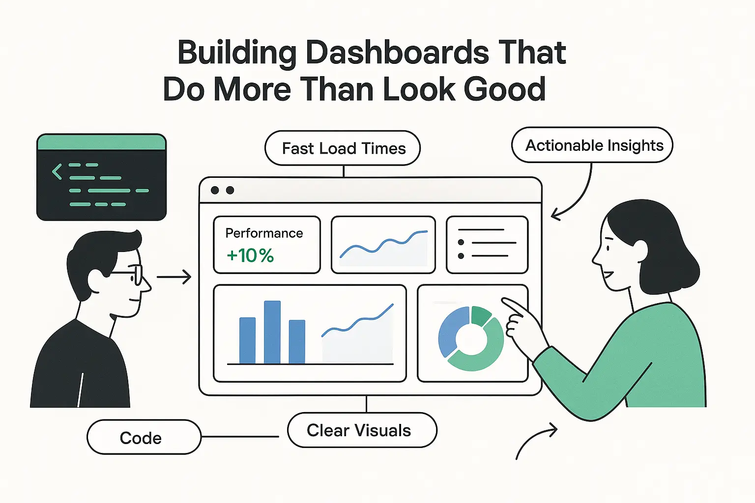
Building Dashboards That Do More Than Look Good
When people think of dashboards, they often picture colorful charts and a clean UI. But the real test of a dashboard isn’t how pretty it looks — it’s whether it helps people make better decisions.
In my work as a frontend developer, I’ve built dashboards for student management systems, financial applications, and now my own project — ClareAI, an AI-powered journaling platform. Each one has taught me that building dashboards is less about visuals and more about clarity, performance, and context.
1. Start With the Questions, Not the Data
A common mistake is to throw every metric onto the screen. But users don’t log in to admire graphs; they log in to answer specific questions:
- “How many students are active this term?”
- “Am I on track with my loan repayment?”
- “What mood patterns keep showing up in my journal?”
By starting with the questions, you avoid clutter and keep the interface focused.
2. Make It Fast
Even a helpful dashboard becomes frustrating if it takes forever to load. At Hire-ng, I worked on optimizing Next.js components and cutting load times by nearly 10%. Small wins in performance add up to a smoother experience, especially when dashboards are opened multiple times a day.
3. Context Is Everything
Numbers alone don’t mean much. For example, in ClareAI, seeing that you logged “3 negative entries this week” isn’t enough — the dashboard also connects it to AI-generated summaries and categories. That context transforms raw data into something actionable.
4. Build for Growth
Dashboards often start simple but grow messy as features are added. Using TypeScript with React and Next.js has been key in my projects. Strong typing makes it easier to extend components, refactor safely, and keep things maintainable as the product scales.
Final Thoughts
A good dashboard isn’t about showing everything — it’s about showing the right things, fast, and in a way that drives action.
That’s the approach I bring to every dashboard I build, whether it’s for an organization, a financial app, or an AI-powered journaling tool. At the end of the day, design and engineering should work together to help people make better decisions — not just stare at pretty charts.